
Making sense of complex financial data is a critical task for individuals, businesses, and financial professionals alike. Bank statement visualization is a powerful tool that helps transform intricate financial information into clear, insightful, and actionable visual representations. In this comprehensive discussion, we will explore the importance of bank statement visualization, its benefits, and various techniques and tools used for making sense of complex financial data.
The Importance of Bank Statement Visualization:
Bank statements are typically dense with financial transactions, including deposits, withdrawals, transfers, fees, and more. Understanding these statements is essential for tracking spending, budgeting, managing cash flow, and making informed financial decisions. However, deciphering complex tables of numbers and text can be daunting and time-consuming, especially for individuals with limited financial expertise.
Bank statement visualization addresses this challenge by presenting financial data in a visual format. Visualizations leverage the human brain’s ability to process and interpret visual information quickly and effectively. By representing financial data graphically, individuals and businesses can gain a clearer understanding of their financial health, identify patterns and trends, detect anomalies, and make more informed financial decisions.
Benefits of Bank Statement Visualization:
- Clarity and Understanding: Visualizations simplify complex financial data, making it easier for individuals to grasp their financial situation. Pie charts, bar graphs, line charts, and other visualization types offer intuitive representations of income, expenses, and balances.
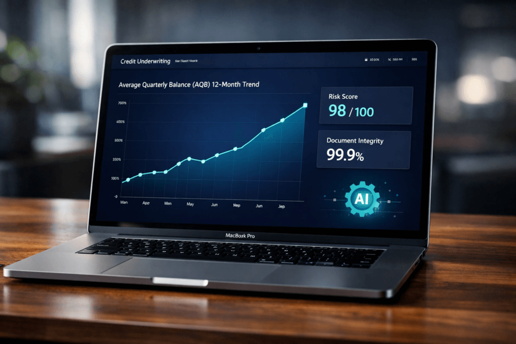
- Identifying Trends: Visualizations can reveal trends and patterns that might be challenging to discern from raw data alone. For example, a line chart showing monthly expenses can highlight fluctuations and seasonal trends.
- Anomaly Detection: Visualization tools can help detect unusual or unexpected financial activity. Sudden spikes in expenses or discrepancies in income and expenses become more apparent when represented graphically.
- Budgeting and Planning: Visualizations are invaluable for budgeting and financial planning. By visualizing income and expenses over time, individuals and businesses can set realistic financial goals and track progress toward them.
- Quick Decision-Making: Visualizations allow for rapid assessment of financial information. Whether it’s assessing the impact of a potential purchase or evaluating investment options, visualizations provide quick insights.
Techniques for Bank Statement Visualization:
- Categorization and Segmentation: Start by categorizing transactions into groups such as groceries, utilities, entertainment, and savings. Visualize these categories using bar charts or pie charts to see the proportion of expenses in each category.
- Time-Series Analysis: To track trends over time, use line charts or area charts to visualize changes in account balances, income, or expenses. These charts can help identify seasonal spending patterns or revenue fluctuations.
- Heatmaps: Heatmaps can be useful for spotting patterns in spending over specific time periods. For instance, a heatmap can represent monthly expenses over the course of a year, with color intensity indicating the spending level for each month.
- Bubble Charts: Bubble charts are effective for visualizing multi-dimensional data. They can represent transactions with three dimensions, such as expense category, transaction date, and transaction amount. The size and color of each bubble can convey additional information.
- Sankey Diagrams: Sankey diagrams are ideal for illustrating the flow of funds between different accounts or financial categories. They can help individuals and businesses understand how money moves within their financial ecosystem.

Tools for Bank Statement Visualization:
Several tools and software applications can help create bank statement visualizations, catering to various levels of technical expertise:
- Microsoft Excel: Excel offers a wide range of charting and graphing capabilities, making it accessible to many users. It’s suitable for basic visualizations such as bar charts, line charts, and pie charts.
- Google Sheets: Google Sheets provides similar charting functionality to Excel and is accessible online, making it convenient for collaboration and sharing.
- Tableau: Tableau is a powerful data visualization tool that offers more advanced capabilities, including interactive dashboards and real-time data connections. It’s well-suited for professionals and businesses looking to create sophisticated visualizations.
- Power BI: Microsoft Power BI is another robust data visualization tool that enables users to create interactive reports and dashboards. It can connect to various data sources, including bank statement data.
- QuickBooks and Other Accounting Software: Many accounting software packages, such as QuickBooks, offer built-in visualization features. Users can generate visual reports and charts directly from their accounting software.
- Online Budgeting Apps: Many online budgeting and personal finance apps provide automated bank statement visualization, simplifying the process for individuals who want to track their finances easily.
Best Practices for Effective Bank Statement Visualization:
To ensure that bank statement visualizations are effective, consider the following best practices:
- Select Appropriate Visualization Types: Choose visualization types that best represent the specific data and insights you want to convey. Avoid overcomplicating visualizations with unnecessary elements.
- Keep it Simple: Clarity should be the primary goal of any visualization. Avoid clutter, excessive detail, or distracting design elements.
- Use Color Wisely: Use color sparingly and meaningfully. Color can help highlight important information or categories but should not overwhelm the viewer.
- Provide Context: Always include context or labels for axes, categories, and data points. Ensure viewers understand what they are looking at and can interpret the visual accurately.
- Interactivity: If possible, add interactivity to your visualizations. Interactive elements like tooltips or filters allow viewers to explore data in more detail.
- Update Regularly: Bank statement visualizations should reflect up-to-date data. Automate the process to ensure that the visuals are always current.
Conclusion:
Bank statement visualization is a powerful tool for making sense of complex financial data. It offers numerous benefits, including improved clarity, trend identification, anomaly detection, and support for budgeting and planning. By employing appropriate techniques and tools, individuals and businesses can harness the power of visualizations to gain valuable insights into their financial health and make informed decisions. Whether you’re using basic spreadsheet software or advanced data visualization tools, the ability to transform complex financial data into clear, actionable visuals can have a profound impact on your financial well-being and decision-making processes.
Simplify your financial analysis with our advanced bank statement analyser tool. Gain actionable insights and improve financial decisions. Book a Demo Now!.


Leave a Reply
You must be logged in to post a comment.